Fonts play a crucial role in design, be it for print or digital media. Two popular font categories that designers often consider are sans serif and serif fonts. In this article, we'll delve into the nuances of these fonts, explore their differences, and find out how they impact design and user experience.
The battle between serif and sans-serif fonts
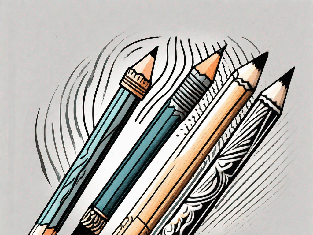
Understand the differences between serif and sans-serif fonts
Before we get into the details, let's first define what serif and sans serif fonts are:
A serif font is characterized by small decorative lines or strokes, called serifs, that extend from the main strokes of the letterforms. Examples of serif fonts include Times New Roman, Garamond and Baskerville. In a sans serif font, however, these decorative lines are missing, as the name suggests. Sans serif fonts are known for their clean, modern, and minimalist appearance. Popular sans serif fonts include Arial, Helvetica and Calibri.
Choosing the right font for your design project
When choosing between sans serif and serif fonts, several factors come into play:
- readability: Serif fonts are often considered more readable in print because the serifs guide the eye along the text. However, sans serif fonts are typically more readable in digital formats and small sizes.
- Color and style: Serif fonts have a classic, sophisticated and traditional feel. They are commonly used in academic publications, formal documents and print media. Sans serif fonts, on the other hand, are associated with modernity, simplicity and informality. They are commonly used in advertising, websites and informal documents.
- The target group: When deciding between sans serif and serif fonts, consider the target audience and their expectations. Serif fonts are more suitable for a mature or conservative audience, while sans serif fonts can convey a more modern and approachable feel.
- Brand identity: If your design project represents a brand, the choice of font should be consistent with the brand's personality and values. A serif font might be a great fit for a luxury brand that strives for elegance and tradition, while a tech company might opt for a clean, futuristic sans serif font.
Font vs. Typeface: What's the Difference?
Exploring the differences between fonts and typefaces
When it comes to fonts, it's important to know the difference between typeface and typeface:
A font refers to a set of stylistically consistent characters that have a specific design. For example, Helvetica is a font that comes in different font sizes, such as regular, bold, and italic. A font, on the other hand, refers to a specific style, weight, and size of a font. For example, Helvetica Regular, Helvetica Bold and Helvetica Italic are different fonts within the Helvetica font family.
Although the terms "font" and "font style" are often used interchangeably, understanding the distinction can help us communicate more precisely when we talk about typography.
Put your knowledge to the test: font quiz
Now that you have a good understanding of sans serif and serif fonts, put your knowledge to the test with a quiz!
1. Which of the following fonts is a serif font?
- A) Arial
- B) Times New Roman
- C) Helvetica
Answer: B) Times New Roman
2. Sans-serif fonts are commonly used in the following areas?
- A) Academic journals
- B) Websites
- C) print media
Answer: B) websites
Test your knowledge and have fun learning more about the world of typography!
The Tech Factor: How Fonts Affect Usability
The role of fonts in web design
Fonts contribute significantly to users' overall experience on websites. Here are some important considerations:
1. Loading speed: Choosing web-safe fonts or using webfont services can ensure faster loading times, avoiding delays and frustration for users.
2. Accessibility: Choosing fonts with sufficient contrast and good readability can make content more accessible to users with visual impairments or reading difficulties.
3. Brand Consistency: Using the same fonts consistently across different touchpoints helps build brand recognition and familiarity.
Optimizing fonts for mobile devices
In today's mobile-dominated world, optimizing fonts for smaller screens is crucial. Consider these tips:
1. Scalability: Ensure fonts are scalable for different screen sizes without compromising readability.
2. Responsive Design: Design responsive websites that adapt font sizes to different devices while maintaining visual hierarchy.
3. Typographic Effects: Leverage CSS features such as text shadows and gradients to improve the readability and visual appeal of fonts on mobile screens.
Exploring related terms in the world of typography
Kerning, Leading and Tracking: Understanding the Basics of Typography
Typography includes several technical terms that play an important role in improving the overall visual impact. Let's define some important terms:
1. Kerning: Kerning refers to adjusting the spacing between pairs of letters to achieve visual balance and improve readability.
2. Leading: Leading, pronounced “ledding,” is the vertical space between the lines of a text. It affects readability and helps determine the visual rhythm of a block of text.
3. Tracking: Tracking adjusts the total distance between letters in a block of text. It can help achieve visual harmony and improve readability.
Typographic Hierarchy: Create visual hierarchy with fonts
Typographic hierarchy is crucial for directing readers' attention and conveying information in a visually orderly manner. Here are some tips:
1. Font Size: Use different font sizes to highlight important elements and create a clear visual hierarchy.
2. Font Weight: Use bold or italic fonts to add emphasis and differentiate between header and body text.
3. Text Alignment: Aligning text left, right, center, or justified can affect visual perception and the hierarchy of information.
Typeface Presentation: Inspiring Examples and Ideas
Inspiration can be found everywhere, including fonts. Here are some ideas for presenting fonts in images:
1. Typography Posters: Design vibrant and eye-catching posters with well-composed typography that showcases the beauty and personality of different fonts.
2. Mood Boards: Compile imagery, textures, and colors that evoke the mood and style of different fonts and inspire designers to explore creative possibilities.
3. Font Pairings: Contrast font pairs side by side and show how different fonts can harmonize or create contrast.
By understanding the differences between serif and sans serif fonts, knowing related terms in typography, and how fonts impact web design and user experience, you can harness the power of fonts to create impactful designs that convey your message effectively convey.